
UX Case Study
UC Davis Library Website
The UC Davis Library website was recently redesigned and I led the UX/UI decisions for this multi year project.
In addition to suffering from a variety of technical and UX pain points, UC Davis launched a new brand. In order to address all of the structural problems as well as bring the site into alignment with the new brand, my team determined that the best solution was to build a new website from the ground up.
Project Priorities:
More intuitive navigation • Improve search functionality • Reduce jargon • Improve content creator experience • Align with new brand • Accessibility • More visually dynamic
Client
UC Davis Library
Core Project Team
Project Manager
UX Designer (me)
Lead Web Developer
Web Developers
Head of Communications and Marketing
Digital Communications Manager
Launch Date: August 2022
Old vs New


NEW
Challenges
Broad user base
The library website must support research at all levels, from Freshman Undergrads writing their first university-level paper to instructors orienting their students on library resources to research faculty and visiting scholars deep in their careers and pursuing innovation in their respective fields.
Third-party integrations
In addition to the core website, which is WordPress based, the library relies on several third-party applications to power a variety of features of the site. My team had to decide when and how to integrate these features seamlessly into the website experience vs what to build in-house.
Large number of content creators
In addition to our small communications team, UC Davis Library website content creators are primarily librarians who, while deeply knowledgable in their respective information and research specialties, have varying technical knowledge and aptitude and are not designers. We needed to provide an interface that allowed them flexibility to build dynamic on-brand content without a steep learning curve.
Brand alignment
UC Davis departmental sites are often built through the campus’ centrally managed Drupal platform called “SiteFarm.” This solution works well for information-centric and brochure-style websites. The library website, however, provides a number of interactive and service-driven user content that wouldn’t fit neatly into the SiteFarm box. Instead we opted to build in WordPress while aligning our look and feel as closely to campus SiteFarm styles as we could. (Spoiler: we did well enough that we fooled central campus communications leaders.)
Process
Discovery
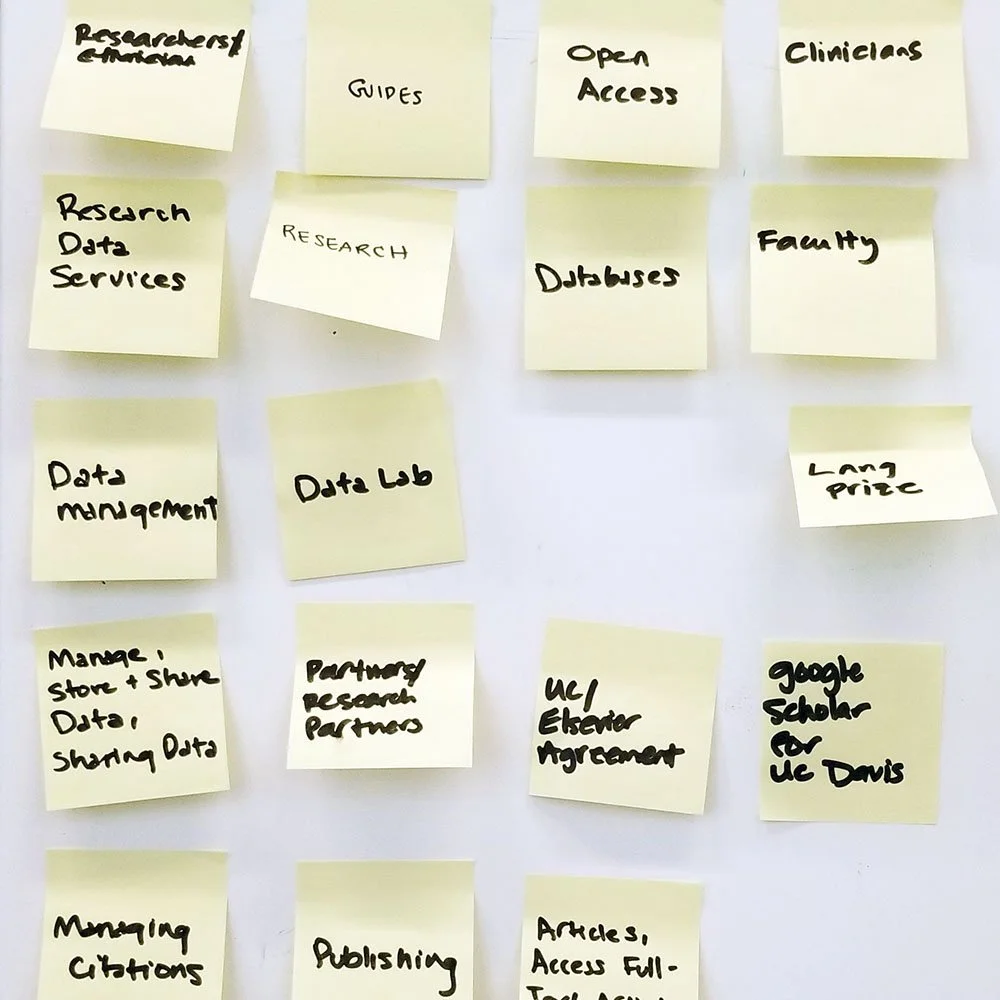
I collaborated with the communications team to review the existing website using a number of methods. We held internal focus groups and interviews. We conducted external user testing of the website with users from every audience category the library serves. We tested internal power users who use the site for their own work and/or guide library users through using the site. We reviewed and evaluated a large number of peer and aspirational university library websites. We also did several card sorting exercises and evaluated website analytics.
Communication
Decision making was managed through a number of committees and cross-department collaboration with a variety of stakeholders. I was a key member of every website committee and meeting and led the charge on design and UX decisions. I was and continue to be the primary liaison between non-technical stakeholders and the library’s development team. In addition to the smaller decision-making groups, townhall-style presentations were regularly provided to keep the redesign process transparent to colleagues library-wide.
Development and testing
The bulk of my UI design process was accomplished using Adobe XD. I have a close working relationship with my web developers and was involved in the development process from initial design prototyping to cross-browser QA testing to manual testing and reporting of bugs post-launch. GitHub, Slack, and Zoom were my team’s go-to tools for managing this process. A weekly project management meeting with the project manager, lead developer, digital communications manager, and me helped to make sure we were on track with our goals and launch deadline.
In addition to technical development and testing, I partnered with our digital communications manager to run user tests on in-process designs and site architecture. Now that we have launched, more user testing is planned for 2023 to continue our pursuit of the ever moving target that is successful web design.

Results
Task-oriented navigation
What does a library even do? User testing showed that beyond providing access to books, many people have no idea. The old site lumped everything the library has to offer into a single “Services” menu category, but if you don’t know what the library can help you with, what reason would there be to click there? The new architecture de-mystifies “Services” into specific user needs and calls out to particular audiences. Users have reported discovering services they didn’t know existed before.
Seamless site search
Site search now seamlessly includes our third party content into the results, integrates with the staff directory, allows for filtering, and sorts by relevance rather than by separating results by content type which is how the old site functioned. Users are finding what they need with less clicks. We continue to tweak this experience based on user feedback and analytics.
In addition to site search integration, LibGuides-based “Research Guides” created and managed by librarians have been themed to look like they are part of the core site and integrate our site’s primary navigation. Even though they are hosted on a different platform, users never realize they have technically exited the main website.
What you see is what you get
We upgraded our WordPress editing interface from a form-based editor to the block-based WYSIWYG Gutenberg editor and provided extremely flexible layout options. This allows our many site content creators to be more creative in their layouts while easily aligning with the UC Davis brand. I also provided direct training and a collection of short how-to videos via our Staff Intranet to get content creators up to speed on the new system.
Unanimous enthusiasm
Internal and external users alike praised the new site, describing it as more intuitive and visually engaging than the old one.
That said, there are always things that can be pushed to be better and my team continues to develop new features and implement further improvements over time based on evolving library needs and user feedback.
Tom Hinds
“Looks fantastic!!!! That old site had issues. Great work!!!”
Stevie Jepson