
Web App
IntertWine
IntertWine is a web application that offers an interactive look at how people, places, and things connect to each other in critical moments of California Wine history.
In addition to designing the user interface, I collaborated with a wine expert from within the library to identify and produce the content that populates the app. After some experimenting, we ended up using Trello with a special content template as a non-technical way for her to input data. It was formatted in a way that a developer could extract and import the data into the web app. We used colored labels to identify which content pieces were missing while the work was in process, and I manually QAed the work when it was complete. It was a highly collaborative process and I was the key person managing the moving parts of the project to keep it rolling forward.

IntertWine content was managed via Trello
This ambitious project ultimately suffered from a lack of funding and a more-short-staffed-than-usual development team. Our lead developer was unable to commit the time due to other higher priority projects, and the junior dev that worked on the project was not quite up to the complexity of the task at hand. The end product was not entirely reflective of the original vision, but the concept is cool, the process was creative and collaborative, and I know if more funding could be secured, my team would happily invest more time and energy into expanding and improving the app.
Project Priorities:
Promote library wine collections • Innovative take on social graphing • Make complex historical data fun and intuitive to explore
Client
UC Davis Library
Core Project Team
UX Designer (me)
Web Developers
Wine Content Expert
Launch Date: 2020
How it Works

Enter a “Moment” in California wine history
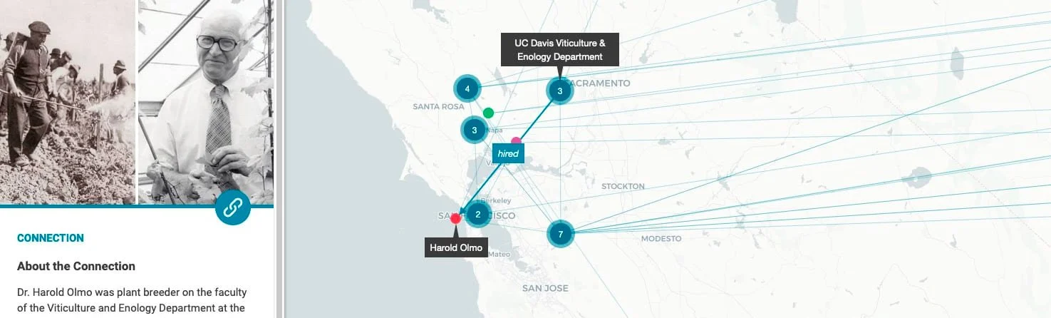
IntertWine highlights key moments in California wine history first through story, then through geographically based social graphing on a map. Before exploring the map, a brief background is provided for the subject, augmented by historic imagery.

Select a point on the map
Once on the map, users can select any colored dot to learn about that thing and see its connections. The dot colors indicate the type of thing: person, place, event, object, or organization.
The sidebar contains brief information about the selected item, and includes links to the details of the item’s connections and resources for more in-depth information on the subject.

Follow the connections
Users can explore at random or travel through the connections between the items on the map to learn more of the details about the often global players that came together to form what makes California wine history great.